Our new look

REbrand

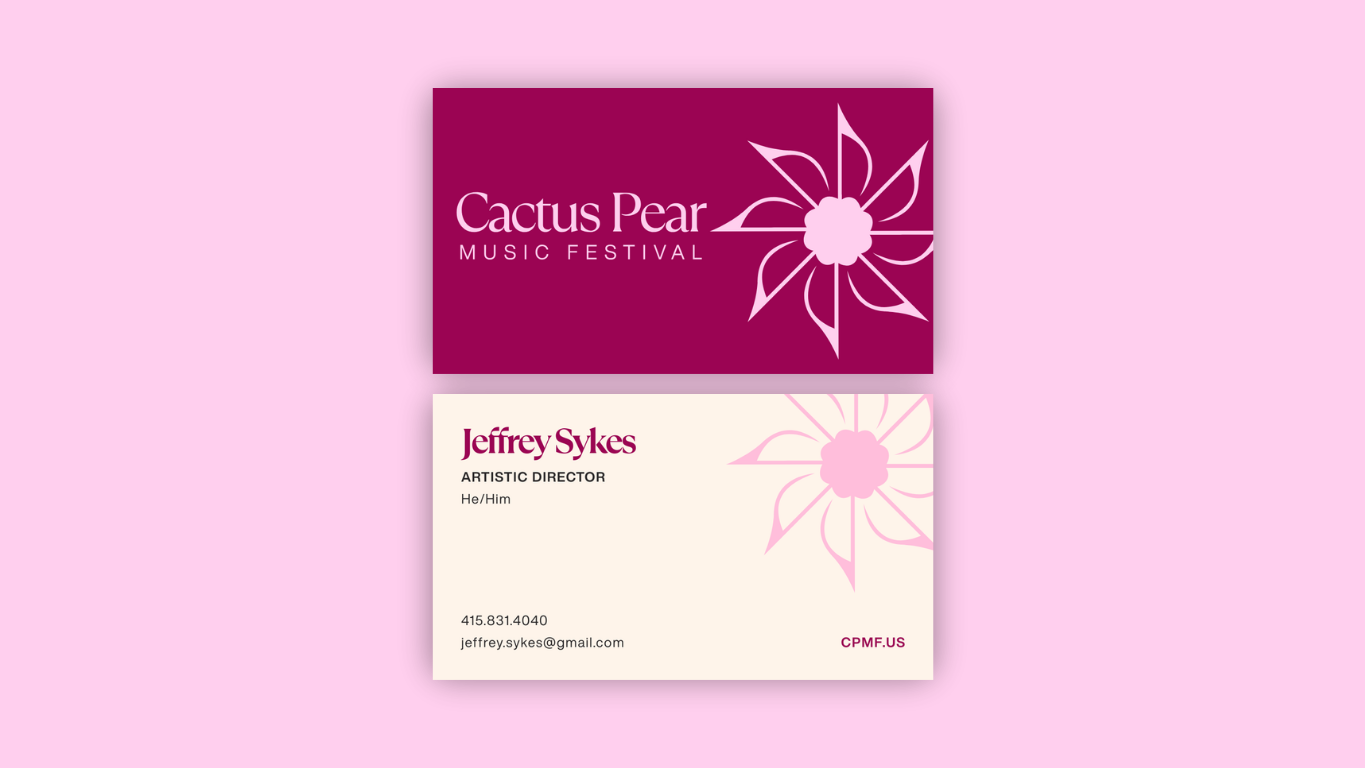
As we enter our 30th season, we’re proud to introduce a refreshed brand that reflects both our legacy and our future. Rooted in the vibrant spirit that has defined the festival since its founding, this new visual identity brings a renewed sense of energy, clarity, and creativity—honoring three decades of extraordinary music while setting the stage for what’s to come.

Updated Logo

A Fresh Expression of Who We Are

ORIGINAL Logo
ORIGINAL Logo
REfreshed Logo

A Symbol Rooted In
Music & Place

Eighth note repetition → creates a cactus pear flower


Radiating form → sun / energy / growth

Circular shape → connection + harmony

Brand Personality

Warm → inviting, friendly, and human


Thoughtful → intentional, reflective, and well-curated

Rooted → connected to place, culture, and community


Inspiring → emotionally resonate and uplifting


Refined, not rigid → polished but never intimidating

Our Brand Colors

A palette inspired by the harmony of music, nature, and Texas summer warmth

Verde
Vibrato

Cactus
Crescendo

Prickly
Pear

Desert
Floral

Fiddlewood Flame

Summer
Sun

The Brand in Action

See how the new identity shows up across posters, digital platforms, and the full festival experience.

Looking Ahead

This new chapter is just the beginning. As we move forward, we remain rooted in what matters most—connection, community, and the shared experience of music. With a renewed vision, we look ahead to many more seasons of inspiring performances and meaningful moments.